Target does it. Home Depot does it. “It” is using signage effectively to help their customers quickly find the products they are looking for.
If successful retailers spend money on signage, it must make financial sense. With today’s printing costs and available technology, even small garden centers can implement a cost-effective signage program.
Signage Fallacies
1. Meandering = more sales
I’ve heard garden center owners say they don’t use signage because they want their customers to meander through the garden center. That also means that the owners are forcing their customers to hunt for plants. Good signage does not prevent the “meanderers” from taking as much time as they want, but it does help those who are in a hurry.
2. Talking = more sales
Others say signage gets in the way of meaningful conversations, including one owner who said he wanted his staff to talk with his customers and didn’t want to lose the personal touch. However, many customers, or potential customers, don’t want to talk to staff. Even if each of his customers wanted help, most garden centers do not have enough educated staff to meet those demands.
Think about how many times you have been asked, “Can I help you?” in a store and you have responded, “No thanks, I’m just looking.” If those stores have appropriate signage, you can make a purchase decision without talking to anyone. If you want to chat or need input, you can still take advantage of knowledgeable staff.
3. Lots of varieties/sizes = no pricing
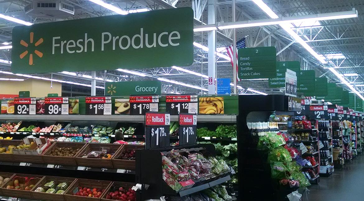
All too frequently I hear, “I have too many varieties and too many sizes to sign everything, and my prices change, so I can’t have signs with prices.” Unfortunately, this is not taking the customer into consideration. As consumers, we expect to know how much something costs, easily. For example, think about the milk coolers at the grocery store. They have gallons, half gallons, pints and quarts in all types of “varieties”; 1 percent, 2 percent, whole, skim, chocolate, soy, organic, almond, coconut, etc. Yet, they all have price signs that can be easily seen without having to pick up the product. I have seen the same size plant individually priced with different prices based on the source. That must be confusing to the shopper.
To continue with the milk example, imagine no shelf price signs and each carton had a price sticker. If some of the 1-gallon, 2 percent milk cartons were priced at $2.29 and others at $2.59, don’t you think there would be some confusion? Shoppers would be picking up all the different products to find the cheapest one. Or, they might be confused enough to not buy, especially if they really don’t need it.
Unfortunately, we’re in an industry where very few plants are “needed,” so we must make it easy for our customers to know the price.
If you need to change your prices, small, all-weather labels are an inexpensive way to update plant prices on an existing bench card.
4. A few signs = good enough
Don’t assume your customers know more than they do. In one garden center, I saw a sign with “All 1 Gallon Perennials = $9.99.” This assumes that shoppers know what both a 1-gallon container and a perennial are. For people who don’t know plants, that would be like an electronics store with this sign, “All 15” laptops with 1.2GHz processors $799.” The “tech nerds” assumed everyone knows what products that refers to. Wouldn’t it be easier for the shopper if all the laptops had an easy to read price sign?
Don’t be the “plant nerd” who assumes the customer knows more than they do.
Know your competition; it’s not who you think it is
Retail stores compete with anyone or anything that takes time and/or money. If your customer runs out of time or money or worse yet, both, they will not be spending either with you. Good signage addresses the time constraint as shoppers can quickly find what they’re looking for, pay and get on with their day.
What is good signage?
An individual sign or type of sign will not cut it. A good sign program will make it easy to:
- Find products they are looking for. (“Where are the deer-resistant plants?”)
- Get exposed to additional products they weren’t coming in to specifically buy. (“Ooh, a flowering tree would be nice!”)
- Understand the product benefits (Full sun, summer bloomer, low maintenance, etc.)
- Know how much it costs ($19.99.)
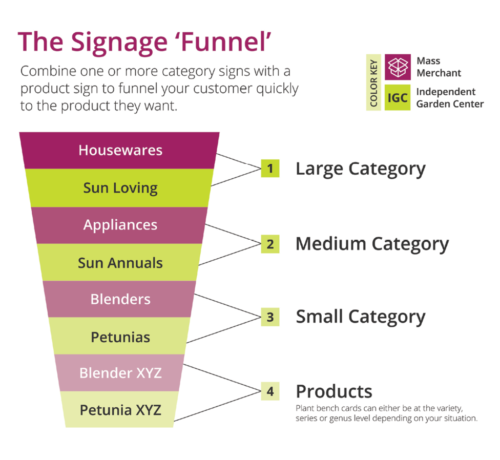
Depending on the size of your garden center and the number of varieties you have, all four levels of signage may not be needed. However, the first and third or fourth levels apply everywhere. See 'Signage Funnel' graphic above.
Show me the light!
If you’re still reading, then you must be interested in starting or improving your signage. Let’s start by addressing five common problems that make signs difficult to read.
Problem: Words are too small to read
One of the biggest sign mistakes is using lettering that is far too small. There are three primary reasons people make this mistake.
- They evaluate the sign on a computer monitor. Between zooming in and being close to the screen, actual size is not represented.
- They start with a proper size font, but as they add more information to the sign, font size is reduced to fit all the words. We’ll talk about reducing sign clutter later.
- They don’t review from a proper distance or angle. Frequently, someone holds a sign up and takes a step or two back and has someone look at it. Unless that sign is read when people are within a step or two, the text will likely be too small.
Solution: Print a few of the words at actual size on your printer
With a standard inkjet or laser printer and letter size paper, you can properly size fonts for most signs. If you think 4-inch letters will be big enough for your sign, print out “Testing” with 4-inch tall letters. Tape the sheets of letters together and put them where the sign will be. Have various people can read the test word from the spot where shoppers will first see it. Based on their feedback, you will know if you need to increase the size of the letters. Also, font size required for legibility varies based on font style. A light-weight “scripty” font, which I wouldn’t recommend in most situations, must be much larger to be easily read as compared to a stronger, simple font.
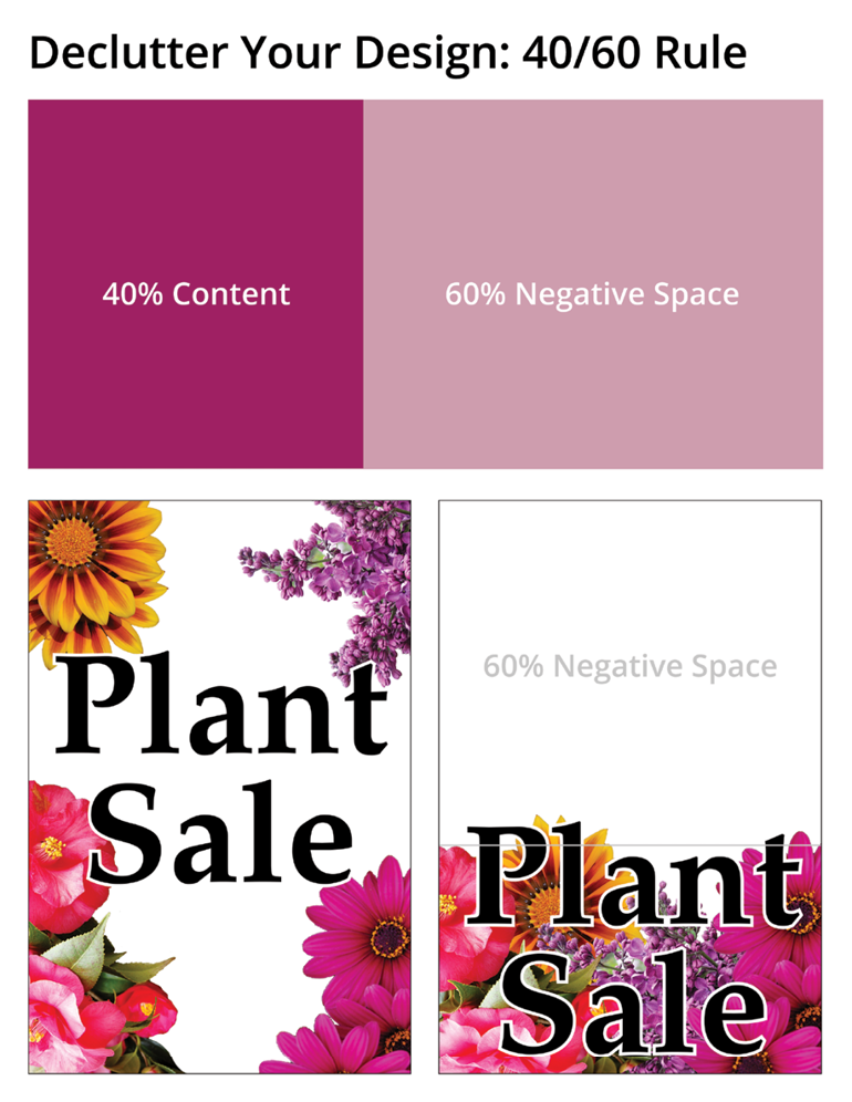
Problem: Sign is cluttered
If you’re not careful, a sign can be transformed into an article very quickly as you keep thinking of things you want to tell your customer. The more you try to say, the less is heard. If your sign is too busy and cluttered, nothing will be communicated. As painful as it is to admit, remember your typical customer cares much, much less about what you have to say than you do. Keep is short and sweet.
Solution: Declutter with math
If you’re verbose, use the 40/60 rule. Keep content to roughly 40 percent with 60 percent white space. Of course, there are some exceptions, but if you use appropriate font sizes and this ratio, it will help you keep your message focused and easy to read.
Problem: Sign can’t be read at certain times of day
Unless you a sign is against a wall, it may be difficult to read due to light “bleeding” through. This is particularly true if the sign will have direct sunlight behind it at some point in the day.
It is a little more expensive, but coroplast (corrugated plastic) and vinyl are available with a block-out layer to prevent light from bleeding through so your message can be easily read.
Problem: Words don’t “pop” like you expect
It is quite common for people to be disappointed with the lack of “pop” on their actual signs versus what they approved on the monitor. Similar to font size, approving color choices based solely on what you see on a computer monitor can result in signs that are difficult to read.
Solution: Follow the road signs
What is the purpose of a road sign? Before reading any further, please take a minute or two to answer that question.....
Road signs are designed to be easily seen and communicate an important message quickly. This should be the same goal for your store signage. Road sign colors are selected for a very high degree of contrast. Think white on green, black on white, white on red, black on yellow and white on blue. “Contrast” does not have to mean “ugly.”
With proper font size and contrast, sings are easily read even from a distance.
Stay Tuned
This is the first in a series of two signage articles that will provide practical solutions and real-world examples to help you step up your sign game.