It is quite common for people to be disappointed with the lack of “pop” on their actual signs versus what they approved on the monitor. Similar to font size, approving color choices based solely on what you see on a computer monitor can result in signs that are difficult to read.
Solution: Follow the road signs
What is the purpose of a road sign? Before reading any further, please take a minute or two to answer that question.....
........
........
The answer is to communicate important information quickly.
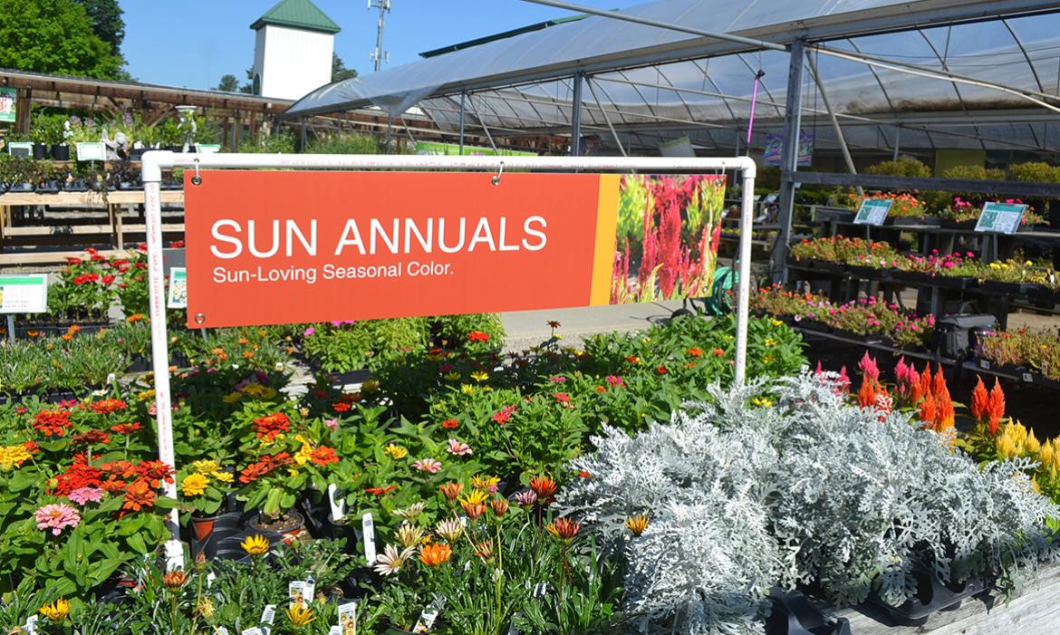
Business signage is no different. Road sign colors are selected for a very high degree of contrast. Think white on green, black on white, white on red, black on yellow and white on blue. “Contrast” does not have to mean “ugly.” Check out some the hight contrast signs here and you'll see that they can be beautiful while clearly communicating the key message, even from a distance.
Check out hundreds of great, high-contrast garden center signs.